

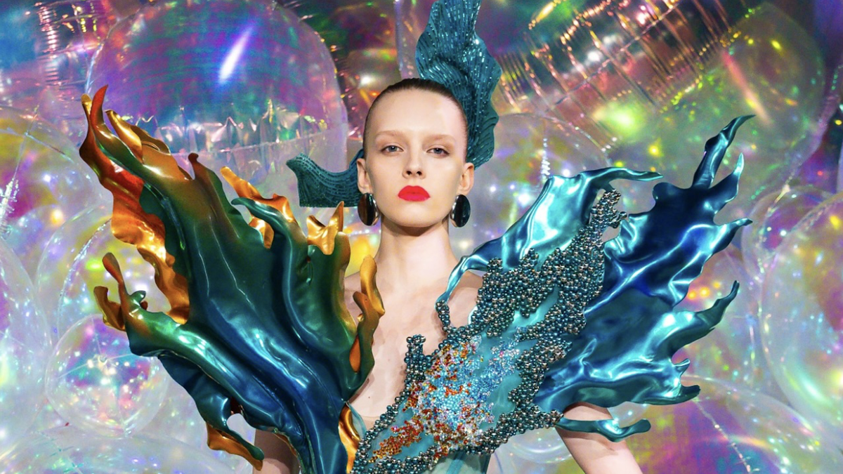
The Liquid Glass design language is updated by Apple on all of its products (Photo: Wired).
At the Worldwide Developers Conference (WWDC) 2025 taking place in the early morning of June 10 (Vietnam time), Apple announced an important change in its design language called "Liquid Glass", applied synchronously across the company's entire product ecosystem.
Inspired by Vision Pro mixed reality glasses, the new interface impresses with its subtle transparency effect. However, as soon as it was launched, Liquid Glass sparked a heated debate in the design world: Beautiful but is it really easy to use?
Ambitious Transparent Beauty
Dubbed “Liquid Glass,” the iOS 26 update, along with Apple’s other operating systems, will bring a completely new look.

With frosted glass effect, bringing a new experience to users (Photo: Wired).
Icons, menus, and notification windows are designed in a frosted glass style, subtly revealing the background color behind.
This design is not limited to the iPhone but will be synchronized across the entire Apple ecosystem, from Apple Watch, iPad to Mac, to create a unified, modern design language, inspired by the interface of the Vision Pro mixed reality glasses.
However, despite being considered bold and aesthetically impressive, the new interface has also met with many concerns from designers, especially regarding its practical usability.
Some of the content is really hard to read. According to Allan Yu, a product designer at the Output app, this is because Apple designed the transparency effect too much. He thinks the company should increase the opacity to make text and graphics more legible.
Sharing the same view, Iteration founder Josh Puckett likened the current version to the first beta of iOS 7, which could be distracting or make it difficult for users to read content.
Still, he believes Apple will improve the experience soon, given its history of focusing on accessibility features.
Not only stopping at reading comprehension, some opinions also say that the visual effects of Liquid Glass can cause unnecessary distraction.
Owner designer Adam Whitcroft says it's a technically impressive effect, but he says there's no example of it actually supporting the content being presented.

FaceTime on iPhone has also been redesigned (Photo: Wired).
He also points out that the effects of light refraction and scattering from the background can be distracting, especially when the interface is constantly changing. “If you design an interface that takes the user’s eyes away from the main content, then you’re clearly doing it wrong,” he concludes.
A new era of emotional design?
Despite the mixed reviews, many designers are still excited about Apple’s new move. Designer Josh Puckett believes that abandoning flat design is the right decision.
“I’m excited to see Apple bring emotion back to digital surfaces, creating interfaces that sparkle, curve, and come to life,” he said, adding that he expects this trend to usher in a new era of more expressive and experiential software.
Similarly, designer Serhii Popov from MacPaw commented that Apple's new interface is "really fresh", making every detail stand out and increasing interactivity, especially on devices like the iPad.
According to some design experts, Apple is showing boldness in its efforts to lead users forward. However, there are still concerns about whether this direction is really the right one.
Source: https://dantri.com.vn/cong-nghe/giao-dien-moi-tren-iphone-dep-nhung-kho-doc-hieu-20250610100644538.htm


Comment (0)