
But by replacing the founding year 2007 with the administrative milestone 1822 in the new design, Ninh Binh Club is making its image ambiguous, confusing and difficult to meet the transparency standards required by professional sports .
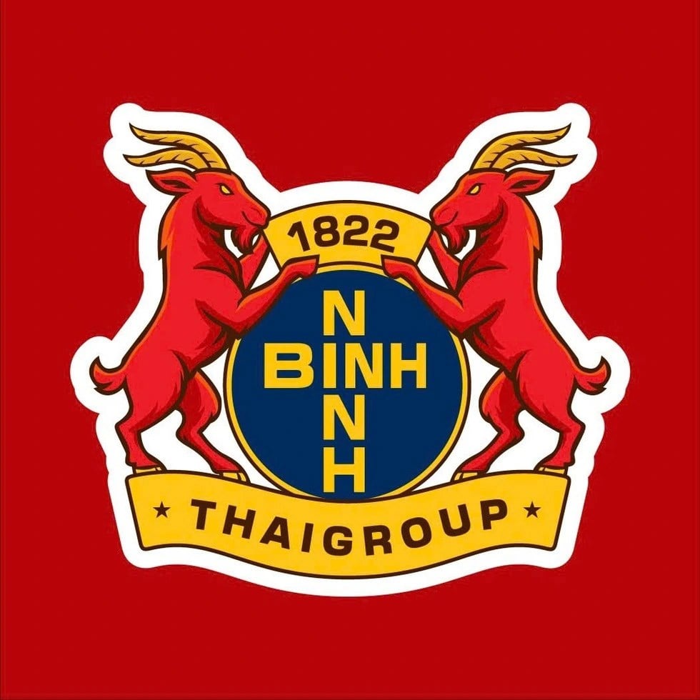
On July 3 in Hanoi , Phu Dong Ninh Binh FC held a ceremony to launch its new brand identity. The new logo was inspired by the image of a mountain goat - a familiar mascot associated with the ancient capital.
Two red goats standing symmetrically represent the spirit of perseverance, courage and solidarity. The center of the logo is the team name “NINH BINH FC” on a dark blue background. Above is the number 2007, the year Vinakansai Ninh Binh Cement Football Club was established. Below is a ribbon with the name of the sponsoring company.
However, on July 14, the Vietnam Football Federation officially approved the renaming of Phu Dong Ninh Binh Club to Ninh Binh Football Club. Along with the renaming, Ninh Binh FC also officially launched a new logo.
It is worth noting that this logo has two changes compared to the previously published logo. Firstly, the year 2007 is replaced by 1822. Secondly, the words “NINH BINH” are rearranged in the shape of a cross “intersecting” the letter I and the letter “FC” is removed.
Regarding the number 1822, according to the explanation, this is an important milestone marking the birth of the name Ninh Binh (in the third year of Minh Mang, 1822, Thanh Binh religion was renamed Ninh Binh religion).
However, including an administrative historical milestone in a sports logo without clear annotation or distinction could lead the public to believe that the club has a history dating back to the 19th century, when in fact the team has only been on the professional map for less than two decades.
There are currently no hard and fast rules or international standards governing the display of years on football club logos. However, in the practice of sports branding and design, there are some unwritten conventions that most professional clubs follow.
First, the year displayed must reflect the year of the club's official establishment. This is the core and most common principle. The year of establishment is usually the year the team was officially recognized by the local association or registered to compete professionally. Displaying this year helps establish the depth of tradition, inheritance and unique identity in the football system.
Next, do not use years that are not related to the team. Using the year of establishment of the locality, the year of birth of the founder or historical milestones outside the scope of the club's activities is often considered misleading or misleading. If they want to express cultural and historical values, clubs often use secondary symbols, slogans or stadium names instead of replacing the year of establishment.
In the early decades of the 20th century, when English and European football began to form a professional competition system, clubs often borrowed the city's coat of arms as their logo.
Manchester City, Aston Villa and Chelsea used to use royal or local government crests directly on their shirts. Since the 1990s, with the globalization of football and the explosion of television, clubs have begun to see logos as an integral part of their branding strategy.
Teams like Juventus, Inter Milan, Manchester City, Arsenal and more recently Leeds United have all caused controversy by “simplifying” their logos to better suit digital design and the global market.
Lettering has been flattened, patterns have been eliminated, traditional elements have been replaced with simpler geometric language. However, not everyone accepts change easily. When Juventus introduced the J logo in 2017, many fans felt like they were being stripped of a piece of history.
In fact, one of the most familiar and controversial details in football logo design is the year of foundation. In most cases, this marks the official birth of the club. However, not all clubs have had a seamless journey. Some teams have been dissolved, merged, renamed or re-established. When this happens, choosing which year is the “official date” for the logo often leads to a debate between tradition and legality.
For example, Rangers (Scotland) still kept the year 1872 even though they were re-established, while Parma (Italy) chose 1913, the year the original club was founded, even though the current team was only re-established after bankruptcy in 2015. Putting the year of founding of a city or locality into the logo like Ninh Binh FC is a rare practice. Through research, so far there has been no similar case recorded in the professional football system.
A professional logo is more than just a shirt. It is intellectual property, representing the club in all its media – from stadiums and playing licenses to copyrighted brands and memorabilia. In the digital age, where any image can be looked up in seconds, transparency and standardisation are paramount.
In that frame of reference, the current logo of Ninh Binh Club is a “non-standard” design. It does not violate legal regulations, but it falls short of professional criteria of being unclear, incompatible with the competition history and can cause misunderstandings to the international media if the team goes far.
The absence of the actual founding year (even though it was only recent) also shows a mentality of being afraid of reality and preferring the past, instead of confidently building an identity from the current foundation.
If the club wants to honor the cultural depth of the ancient capital, it can add a secondary slogan, design a “heritage” version of the logo, or integrate historical elements into the extended identity. But the main logo (representing professional status) needs to be clear, accurate, and reflect the club’s age.
Source: https://baovanhoa.vn/the-thao/logo-bong-da-khong-phai-la-co-may-thoi-gian-153464.html


![[Infographic] In 2025, 47 products will achieve national OCOP](https://vphoto.vietnam.vn/thumb/402x226/vietnam/resource/IMAGE/2025/7/16/5d672398b0744db3ab920e05db8e5b7d)


Comment (0)