

Google Messages beta users are starting to experience a rebranding, as the app switches from a multicolored “G” icon to its full name. This is a move to unify the look and feel of other Google apps, while also incorporating Material 3 Expressive design for a more modern, intuitive experience.
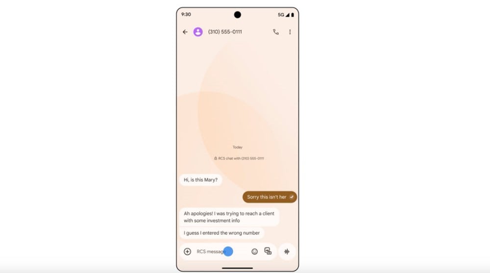
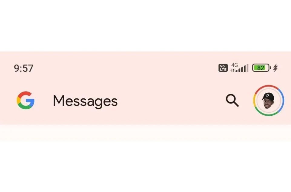
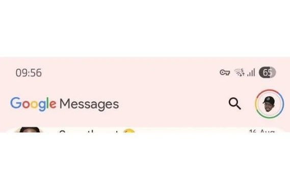
For years, Google Messages has been synonymous with the familiar multicolored “G” logo. However, some users have recently started to notice a big change: instead of just the logo, the app now displays the words Google Messages in a standard font.
Initially, the text appeared in a simple white color scheme. But as reported in July, some people have now seen a full-color version of the logo in shades of blue, red, yellow, and green — similar to how Google brands many of its other popular apps, like Gmail and Google Drive, with the exception of a few, like Google Maps, that have kept their own unique style.
Slow rollout, first for beta users
The rebranding is reportedly still in testing and is mostly appearing on the beta version of the app. Stable users will still see the old “G” logo. The rollout is reportedly slow, so most users are yet to see the new look.
For many tech users, this change may not be that significant. But for those who aren’t tech-savvy, showing the full name instead of just the icon makes it easier to recognize and find apps. At the same time, this move also helps Google unify its branding across its app ecosystem.
Upgrade your look with Material 3 Expressive
In addition to the rebranding, Google Messages is adopting the new Material 3 Expressive design language. This is a big step forward in terms of interface, bringing a smoother experience, better customization, and especially emphasizing the most important actions in the app.
Many experts believe that the acceleration of the redesign process may be related to the launch of Pixel 10, when Google wants to optimize the experience of synchronization between hardware and software.
With a change in both branding and design, Google Messages promises to not only become more recognizable, but also bring a more modern and user-friendly messaging experience.
According to Phone Arena
Source: https://baovanhoa.vn/nhip-song-so/google-messages-thay-logo-g-nhieu-mau-bang-ten-day-du-163768.html
![[Photo] General Secretary To Lam attends the 80th anniversary of Vietnam's diplomacy](https://vphoto.vietnam.vn/thumb/1200x675/vietnam/resource/IMAGE/2025/8/25/3dc715efdbf74937b6fe8072bac5cb30)


Comment (0)