

On July 8, information from the People's Committee of Da Nang City said that according to the plan to carry out the campaign to create a Da Nang logo (abbreviated as the new Da Nang logo), the Department of Culture, Sports and Tourism has deployed, compiled the participating works and proposed the campaign's advisory council to select the best designs.
Accordingly, to complete the selected sketches, the Department of Culture, Sports and Tourism requests agencies, units and people to contribute ideas for the new Da Nang logo sketches.
According to the Department of Culture, Sports and Tourism of Da Nang City, the four options selected by the advisory council all share the same criteria: concise, simple, modern, easily recognizable and easy to apply on many materials.
In terms of expression, although different, the 4 new Da Nang logos all take 4 images familiar to local people and tourists, including: Dragon Bridge, Marble Mountains, My Son Tower and Hoi An Ancient Town.


Sample 1 and sample 2 of the new Da Nang logo
PHOTO: HOANG SON
According to the explanation, the new Da Nang logo is an image created with simple, stylized, plain and familiar colors; it is an expression that closely combines nature, cultural - architectural - tourism symbols and the modern spirit of the city, connecting, maintaining national identity, intermingling, and striving to develop in the new era.
The center of the logo is a layered triangular block reminiscent of the Marble Mountains - a highly stylized scenic spot with unique mountains and waters.
The white contours create depth and visual movement, suggesting a view of modern urban architecture and a vision of the future, expressing the city's constant transformation.


Sample 3 and sample 4 of the new Da Nang logo
PHOTO: HOANG SON
The image of two world cultural heritages, My Son Sanctuary and the Japanese Covered Bridge (Hoi An), placed in the middle, emphasizes the position of a strongly developing seaport city, a harmony between nature and urban areas, between traditional heritage and modern development; both youthful, friendly and dynamic and creative.
The image of the Dragon Bridge with a rounded left corner reaching out to the East Sea depicts the new Da Nang City in harmony and rising up with the new era; it is a message of strength, luck, favorable time, favorable location, favorable people and prosperity, reaching out to the sea.

The old Da Nang logo only showed the characteristics of the city before merging with Quang Nam, such as: Han River swing bridge, Ngu Hanh Son...
PHOTO: HOANG SON
The horizontal stripes and white waves sparkling in the fields and rivers: "green mountains, green rivers, blue seas; sunshine and wind, white sky, white sand" highlight the words "Da Nang" as a solid foundation along with the circular contour, showing the city moving towards strong comprehensive development in the era of creative growth.
The Department of Culture, Sports and Tourism of Da Nang City said that the collection of public opinions for the new Da Nang logo designs will take place until July 15 via email: svhttdl@danang.gov.vn.
Source: https://thanhnien.vn/4-logo-da-nang-moi-dang-duoc-lay-y-kien-nguoi-dan-co-gi-dac-biet-185250708175328948.htm
![[Photo] The first meeting of the Cooperation Committee between the National Assembly of Vietnam and the National People's Congress of China](https://vphoto.vietnam.vn/thumb/1200x675/vietnam/resource/IMAGE/2025/8/31/f5ed4def2e8f48e1a69b31464d355e12)

![[Photo] General Secretary To Lam receives Chairman of the National People's Congress of China Zhao Leji](https://vphoto.vietnam.vn/thumb/1200x675/vietnam/resource/IMAGE/2025/8/31/5af9b8d4ba2143348afe1c7ce6b7fa04)
![[Photo] National Assembly Chairman Tran Thanh Man welcomes and holds talks with Chairman of the National People's Congress of China Zhao Leji](https://vphoto.vietnam.vn/thumb/1200x675/vietnam/resource/IMAGE/2025/8/31/9fa5b4d3f67d450682c03d35cabba711)
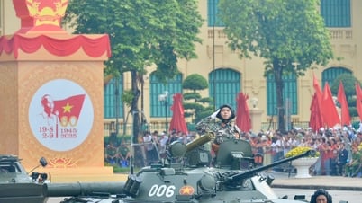
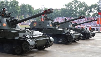
![[Photo] Marching together in the hearts of the people](https://vphoto.vietnam.vn/thumb/1200x675/vietnam/resource/IMAGE/2025/8/31/8b778f9202e54a60919734e6f1d938c3)


Comment (0)